Showing posts with label photography. Show all posts

Friday, February 3, 2012

Valentine's Day Elements kit, and a freebie!

I have just completed the coordinating kit to "the Blues", with "be Mine" Valentine's Day kit elements.
I started off designing a bunch of papers for another digital card making kit, that was meant to be completed before Christmas. Well, that didn't happen, needless to say! However, I didn't give up on it!
I decided to release several kits that all "go" together, representing various holidays. So watch for these as the holidays roll around!


So the idea is to get yourself the starter pack, with the papers, then add on to it as you like.
The colours go great with photos of people in blue jeans and denim!

I've already added a great new alpha to the bunch, which can be used for Project 365, or 52, and now the Valentine's Day elements kit!

I got my inspiration from our daughter and family's Christmas photo shoot, and based several Christmas card templates on this palette of colours. Here is the card they used, and these elements are in the Christmas Element pack.


I designed this card as a "quick page". It's a png file, with a space available for you to place your own photo. Easy Peasy!
Without further ado, here is your freebie:
Amazing photo, of my adorable grandson and our daughter, by Christina Clause is not included!
Check her blog: here


Please take a moment to leave a comment! It is so much appreciated to be appreciated! 

Thanks,
Happy Scrapping, and Happy Valentine's Day!
Marlene

Monday, January 23, 2012

Another Giveaway! And a Freebie!

I am one of the vendors at the Creme de la Baby Giveaway! Go check it out! Wait! First have a look at what I'm giving away:

Summer Sun-kissed Textures
"Baby Soft" - digital card making kit 
Fabric Texture Plates

These are all available at Etsy

If you are curious about how to use textures in your photography editing, or digital scrapbook layouts, have a look here at a previous post about using testures.

I have been trying, without success to get an "exclusive" tab on my facebook page. I just don't know how to go about this!!! (can you tell I'm getting frustrated!!!)

How about I just give away a new texture pack, and as thanks, you can go and "like" my facebook page!? how does that sound?

Here is the preview, just click on the link below to download. This will be available for a limited time.
(maybe until I can figure it out!!!)

 Link expired:

All of the textures shown here are on "overlay" at 100% opacity, just to give you a small example of what they look like! The fun is in trying out different blending modes.

Please be kind, and leave a comment when you download! Let me know that you "liked" my facebook page.  You never know, you just might get something in return!!

Thanks for stopping by,
Happy Scrapping!
Marlene

Friday, June 3, 2011

Using textures in photography, 3 easy steps to take your photo from commonplace to compelling.


A few of weeks ago, I took some pictures of blossoms in our beautiful Niagara region. My DD lives just outside of the city, and on the street to get to her place are many orchards. During blossom season, the trees are just exploding with colour! Every day just gets more beautiful, until they reach their peak, and before you know it, it's all over!
I took some time to slow down, stop at the side of the road, and take pictures! I made sure to take my camera's manual with me, because I knew I would want to play with exposure and aperture. I still have a lot to learn about photography, but the best way to learn is to do it!

I still don't know what kind of trees I was taking pictures of! I did know they were pretty, and I wanted to capture that. I also wanted to create a fine art print, using some the of the new textures I've designed.


3 Easy steps to go from commonplace to compelling:
     1. The first step is to open your photo in photoshop, or photoshop elements. Make sure that you do all of the editing, cropping, and adjustments that you want to do at this stage.
     2.  The next step is to add the texture layer. There are always several ways to accomplish anything you want to do in photoshop. You could (a) go to "file" and "place" the texture layer, (b) open the texture, drag and drop it onto your photo. Holding down the shift key while doing this will ensure that it will be centred over your photo, (c) open the texture, drag and drop the layer in the layers palette onto the photo, or (d) select the texture, go to "edit" and click "copy", then "paste" it onto the photo. Using keyboard shortcuts is great with this technique.
Once you have the texture layer over the photo layer, you will need to adjust the texture's size to fit over the photo. Go to "edit" and "transform", holding the shift key will keep the aspect ratio when pulling the handles on the corners, or just grab the handles on the sides, and stretch to fit.
     3. The next step is to adjust the blend mode and opacity. This is where it gets exiting! My favourite blend modes so far have been, multiply, linear light, overlay, and soft light, when texturing my photos. I have had some success as well with duplicating a texture layer, and choosing 2 different blend modes at different opacities.
Opacity will also make a huge difference in the final outcome. You will most likely need to adjust the opacity so as not to overwhelm the photo.


----------------------------------------------

Experimenting with the blend modes and opacity is fun and exciting. It's great to see how much the mood, colour and lighting are transformed before your eyes as you do this. I usually duplicate the layers I'm working on, try a few different blend modes, and see which layers I like and want to keep, and get rid of the ones that aren't working. Sometimes it's a combination that's works out the best.
In my example, I used 3 separate layers to make my texture. I used texture layers from my new "Summer Sun Kissed Texture" pack.


The first layer is "lavender mist", which has the blend mode set at soft light, and opacity is at 100%. The second layer is "TexturePlate-painterly", it's blend mode is overlay, and the opacity is at 85%, and the last layer, is "Sun Kissed Edge". The blend mode is linear light, and the opacity is at 40%.


A few more examples:


Thanks for taking the time to stop by, and as always, please feel free to leave a comment, tell me what you think, or share a link to your own textured photos.
Happy Editing!
Marlene

Friday, May 20, 2011

Freebie Friday! Textures for Photographers and Digital Scrapbookers

The sun is shining again, and the promise of summer is right around the corner. That puts me in a good mood, how about you? I have continued working on some more textures, and I decided to share a small sample of these newest creations with all of  you.


These are 12 x 12, 300 dpi jpg's. They can be used as digital paper, or overlays in scrabooking layouts, or photographers can use them to texture their photos. See the previous blog entry for more info about texturing photos.

If you download, please be kind, leave a comment. Designers work hard to bring you freebies, we really appreciate getting some feedback.

Please feel free to link to your layouts, or photos!! I'd love to see your creations!!

Happy Scrapping and editing!
Marlene

Thursday, May 19, 2011

Learning about Texturing Photos and Digital Scrapbooking Layouts

I came across a fantastic article recently, which explained a lot about textures in photography, how, when and why to use them.

I've always love texture, in whatever medium I've been using, from my metal and jewellery days, to now when designing digital scrapbooking papers.

What I've learned so far, (and I've got much more to learn) is that textures aren't there to fix bad photos. Garbage in, garbage out!

It does add interest, changes the mood and lighting, can enhance or change the style of the photograph or digital scrapbooking layout.


So... I've been having some fun designing some textures, and experimenting with some of my own photos and layouts. (I will be putting together a package of them and they will be available at my Esty shop)

here are some Before and After photos:

This first set, I broke my first rule, I don't think this is a great photo to begin with, but I was anxious to try out some of my new textures! Once I got started, I just kept going! I like the results, though, and that's what matters!

Before:
After:

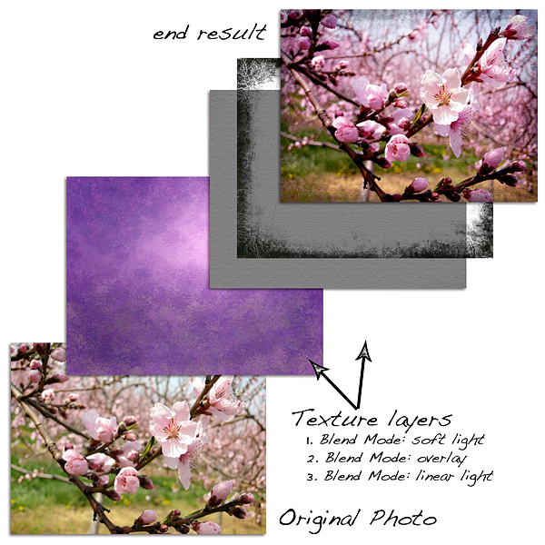
 I cropped the photo, then used 2 layers of "bokeh" texture, and 2 layers of "paint" texture plates.

I used a gausian blur on the 2 bokeh texture layers, one had the blending mode set to "multiply" and the other to "soft light" On the bokeh layers, and on one of the paint layers, I brushed out the cactus flower, and also used different blending modes.

I also used an action from Pure Photoshop Actions: Pure pink, which boosted the colour a bit more. They have some great actions! They are subtle, but still pack a punch!

These are the textures I designed and used in the above example:


The key is working with layers, blending modes, opacity, and even filters, to achieve the look you want, (or sometimes you get happy accidents)!

Here are more Before and Afters:
Before:


After:


After again, adding a border:


This photo was taken at the Port Dalhousie pier. I like the way the texture has changed the colouring on this photo. Although the original photo does have a nice quality to it, I believe that the texture has made a difference in the mood of this photo. It's gone from slightly ethereal to rugged to painterly.

The last one was processed with a "paint" texture plate, and 2 versions of the texture below, one layers blending mode set to overlay, and the purple one set to multiply.
I brushed out the rocks on this one as well.


Here is another example,
Before:


After:


I did a series of Valentines day cards for my Hubby and the kids. I'm not partial to pink, so this was my answer to making cards for them, with out all the girly pink!
The texture layer is green, with a bit of brown. I set the blending mode to overlay, and brushed out the area over the photo. I like both looks, but the texture definitely adds some interest to the layout.

Before:

 After:


This is a layout from my dad's memoirs that I've been working on for a long time. Have a look here to see more of these layouts.
This one looks great after the texture has been added. It adds a sepia colour to it, and the crackled texture also ages the layout, and tones down the contrast, which is quite suitable for a heritage layout.

This is a learning process, to be sure, and I know I'm not there yet, but this sure is a lot of fun!

Here's the link to that fantastic article:


Thanks for stopping by!
Please feel free to share a link to your photos or layouts that you've incorporated some textures in!
Or, just share your thoughts.
Happy Scrapping, and Happy editing!
Marlene

Tuesday, March 29, 2011

Photography related vendors give-away now in progress


This is my contribution to the giveaway hosted at Photography Related Vendors 
This can be used as a birth announcement, thank you card, or promo card. I will even personalize it for you! If you are the winner of this prize, please contact me at: FigmentGraphics
It is also available for sale at Etsy. I am also offering a 20% discount at Etsy, use the coupon code at checkout: BIRTHDAY2011  

I  have used elements and digital paper from my digital scrapbooking kit "Snow Day", to create this birth announcement, and I am very willing to work with you to custom design one for you!

There are just under $2000.00 worth of prizes being given away. If you love photography, props, backdrops and templates, and want to get in on the contest, head on over to Ginny's blog, or facebook page: Photography-Related-Vendors on facebook.